Responsify WP wordpress plugin resources analysis
| Download This Plugin | |
| Download Elegant Themes | |
| Name | Responsify WP |
| Version | 1.7.2 |
| Author | Stefan Ledin |
| Rating | 100 |
| Last updated | 2015-03-02 12:49:00 |
| Downloads |
2305
|
| Download Plugins Speed Test plugin for Wordpress | |
Home page
Delta: 0%
Post page
Delta: 0%
Home page PageSpeed score has been degraded by 0%, while Post page PageSpeed score has been degraded by 0%
Responsify WP plugin added 7 kB of resources to the Home page and 7 kB of resources to the sample Post page.
Responsify WP plugin added 0 new host(s) to the Home page and 0 new host(s) to the sample Post page.
Great! Responsify WP plugin ads no tables to your Wordpress blog database.Responsify WP is the WordPress plugin that cares about responsive images.
- Use
imgwith srcset/sizes attributes. - ...or the
pictureelement. - Works with or without Picturefill.
- Supports high resolution images (retina).
- Custom media queries.
- Handpick which image sizes to use.
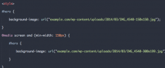
- Responsive background images.
Responsify WP finds all images inside the_content() and makes them responsive. For example, you might have a template that looks like this:
<article>
    <h1><?php the_title();?></h1>
    <?php the_content();?>
</article>
That will output something like this:
<article>
    <h1>Hello world</h1>
    <p>Lorem ipsum dolor sit amet...</p>
    <img src="large.jpg" alt="Image description">
</article>
But once you have activated the plugin, it will look like this instead:
<article>
    <h1>Hello world</h1>
    <p>Lorem ipsum dolor sit amet...</p>
    <img sizes="(min-width: 300px) 1024px, (min-width: 150x) 300px, 150px"
        srcset="thumbnail.jpg 150w,
        medium.jpg 300w,
        large.jpg 1024w"
        alt="Image description">
</article>
You can also choose to use the picture element instead:
<article>
    <h1>Hello world</h1>
    <p>Lorem ipsum dolor sit amet...</p>
    <picture>
        <source srcset="full-size.jpg" media="(min-width: 1024px)">
        <source srcset="large.jpg" media="(min-width: 300px)">
        <source srcset="medium.jpg" media="(min-width: 150px)">
        <img srcset="thumbnail.jpg" alt="Image description">
    </picture>
</article>
It also works with high resolution (retina) images:
<article>
    <h1>Hello world</h1>
    <p>Lorem ipsum dolor sit amet...</p>
    <picture>
        <source srcset="full-size.jpg" media="(min-width: 1024px)">
        <source srcset="large.jpg, large_retina.jpg 2x" media="(min-width: 300px)">
        <source srcset="medium.jpg, medium_retina.jpg 2x" media="(min-width: 150px)">
        <img srcset="thumbnail.jpg, thumbnail_retina.jpg 2x" alt="Image description">
    </picture>
</article>
The different versions of the image in the examples above is in the standard thumbnail, medium, large and full sizes.
The media queries are based on the width of the "previous" image.
Any custom sizes of the image will also be found and used.
Settings
You can select which image sizes that the plugin should use from the RWP settings page.
These settings can be overwritten from your templates.
<?php

// Using get_posts()
$posts = get_posts( array(
    'post_type' => 'portfolio',
    'rwp_settings' => array(
        'sizes' => array('large', 'full')
    )
) );

// Using WP_Query()
$query = new WP_Query( array(
    'category_name' => 'wordpress',
    'rwp_settings' => array(
        'sizes' => array('large', 'full')
    )
) );
if ( $query->have_posts() ) {
    // ...
}
?>
Available settings:
- Select which image sizes to use.
- Set/override attributes.
- Set custom media queries.
- Turn on/off retina.
- Ignore image formats.
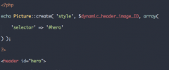
Picture::create( $type, $attachment_id, $settings )
In your templates, you can use the Picture::create() function to generate Picturefill markup.
Let's say that you have the following markup for a very large header image:
<header>
    <?php the_post_thumbnail( 'full' ); ?>
</header>
As you probably know, the_post_thumbnail() will just create a regular <img> tag for the full-size image in this case.
But you don't want to send a big 1440px image to a mobile device. This can easily be solved like this:
<header>
    <?php
    $thumbnail_id = get_post_thumbnail_id( $post->ID );

    // Generate an <img> tag with srcset/sizes attributes.
    echo Picture::create( 'img', $thumbnail_id );

    // Generate a <picture> element
    echo Picture::create( 'element', $thumbnail_id );
    ?>
</header>
Full documentation and examples can be found at GitHub.


