We are living in a world, where mobile dominates an online shopper behavior. Put it simply, more and more users are using mobile devices instead of desktop for browsing the Internet, and most importantly, to make purchases. This suggests that making our websites mobile-ready has become more important than ever before.
Furthermore, with the release of Google’s new mobile-friendly algorithm update, according to which “mobile-friendliness will affect ranking on Google search engine”, running a website optimized for mobile devices has become a necessity than any passing trend.
Are you running a WordPress site that isn’t mobile-ready? Then reading this post will help you learn 5 dead easy tips on making your site optimized for mobile phones.
#Tip 1 – Pick a Suitable Mobile-Friendly WordPress Theme
You can make your website deliver consistent experiences to users no matter whether it is accessed via a desktop screen or a mobile device, by opting for a WordPress mobile theme. There are plenty of great WordPress themes available over the web, helping you set up a site and make it running in no time. In fact, picking the right mobile-friendly theme even save you from spending your time and money in hiring a professional to get the job done.
Just as the number of mobile devices is increasing, even the number of mobile themes is also on a rise.
#Tip 2 – Evaluate Your Website Using Google’s Mobile-friendly Test Tool.
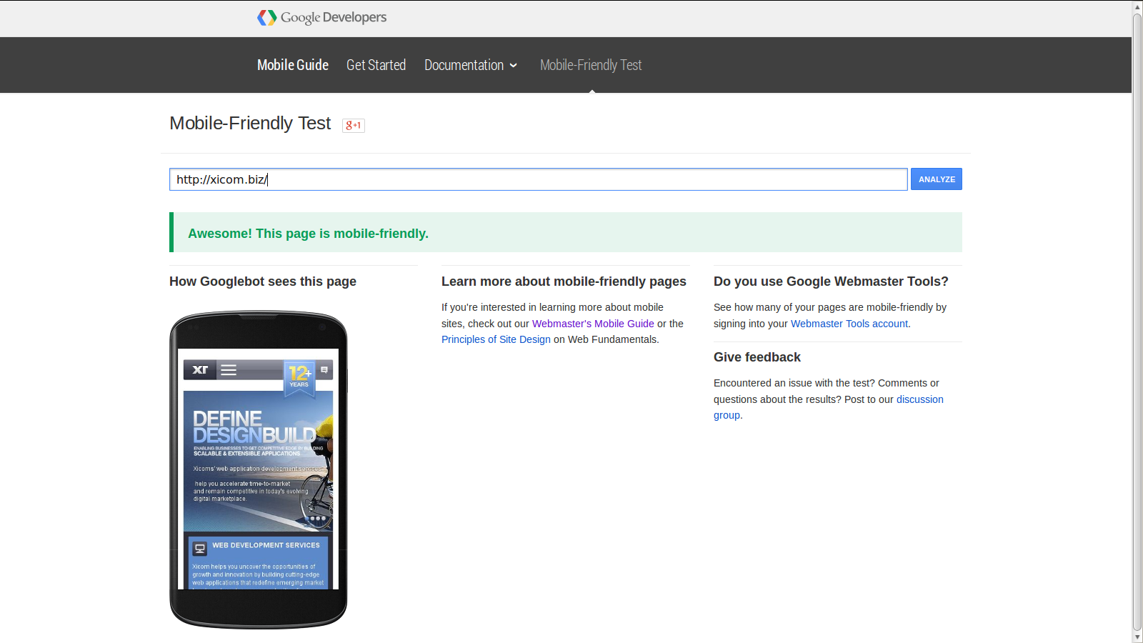
Even though, you’ve installed a WordPress theme designed for mobile devices, it would be better if you’ll test whether it really features a mobile-friendly design or not. Luckily, you can do so with the help of Google’s mobile-friendly test tool. The best part is that the tool also explains the issues as to why a site is not mobile-friendly.
For example, here is a screen shot of the output I received after testing my website using the Google test tool:
#Tip 3 – Installing the Right Plugins
The third most important yet easy tip, you can follow is to install and activate the plugins that make the task of making your WP site more streamlined. You can find tons of great plugins serving many different purposes, including the ones that help in making your website mobile-friendly.
As a website owner, you’ll probably find yourself being short of time, when it comes to focusing on important aspects of the site. Moreover, you might not lack the technical knowledge required to make your site gear up for mobile devices. However, using a WordPress plugin can help you make your site mobile-friendly without having you to code.
For example: WP Mobile Detector plugin helps optimize sites for mobile devices in a matter of few seconds. This plugin, as the name implies, detects the device a user is using to access your site and accordingly loads a mobile theme.
#Tip 4 – Make Your Website Design Responsive
The best way to make your site mobile-ready is to make its design responsive. In essence, make sure that your site layout respond to the device, it is being accessed on. For instance, when viewed on a desktop screen, your site must be displayed in a manner that makes it look great on desktop systems. Likewise, your site must look good when viewed using any Smartphone or a tablet.
WordPress makes the task of having a responsive website easy, all you have to do is select a theme and customize it using the drag-and-drop page builder that comes prepackaged with WordPress.
If you’re still finding any difficulty in making your site feature a responsive layout, you can even look for professional assistance. In simple words, there are various web development companies that help in offering WordPress web development services to address your needs.
#Tip 5 – Create Content For Mobile Users
When users view any site via a mobile device, they usually skip most of the content and like to access the part that appears worthy to them. On the other hand, users visits a desktop site, when they need to access more information about your site. And so, when designing your site, you need to ensure that the content may seem irrelevant to mobile users isn’t visible when your site is being viewed using a mobile phone.
One great way to achieve such an objective requires hiding navigation menus, which opens up (or expand) when clicking on any icon or a symbol. For this, you’ll need to use CSS media queries, as it helps in making the menu responsive. Besides this, make sure to include large size buttons that are easy to tap even when your site is being navigated using smaller screen devices.
Conclusion
Making your WordPress site optimized for mobile devices isn’t a complicated process, and can rather turn out a simple process using the aforementioned tips.
About The Author
Amanda Cline
Currently employed with Xicom Technologies Ltd.- Offshore web development Company , Amanda can serve as an excellent asset for your web development project. Amanda Cline is a web developer with an excellent track record of having delivered simple and complex web development projects. If you're looking forward to hire developer then you can get in touch with here via - @amandacline111.