From time to time, I discover sites with pretty good/useful content, but with layouts that make me wonder if my computer’s calendar isn’t showing a date that’s two decades ahead… Fortunately, there are plenty of tools for webmasters who want to use layouts to match the century we’re living in and enhance their user’s experience while visiting their site(s). Today, we’ll take a quick look at such a tool, namely Not Just A Grid.

Freely available under the terms of the MIT License, Not Just A Grid “is a flexible and modular css framework that is designed to assist in the rapid prototyping and development of websites.” While others still look back and wish for older technologies to hang on for a few years more, Not Just A Grid comes with support for the future, offering accommodation for larger screen sizes and use of CSS3 to progressively enhance the user experience on any device. Excellent!
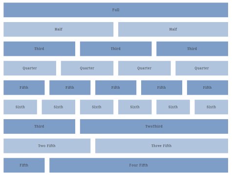
Not Just A Grid offers multi-column layouts, forms, tables, typography and pagination/alert boxes, every part of the framework coming in a separate stylesheet and the resulting layout having only 1 KB in size. Even more, we’re not talking about a fluid layout here – sure, some may say this is bad, but I know quite a few people who would rather have 4 hard-coded widths at their disposal, each with support for 1 to 6 layouts. These widths are 100, 960, 1380 and 1500 pixels, but a demo is always better than a thousand words, so… click here and enjoy Not Just A Grid! 😉